
Seeing in Contrast
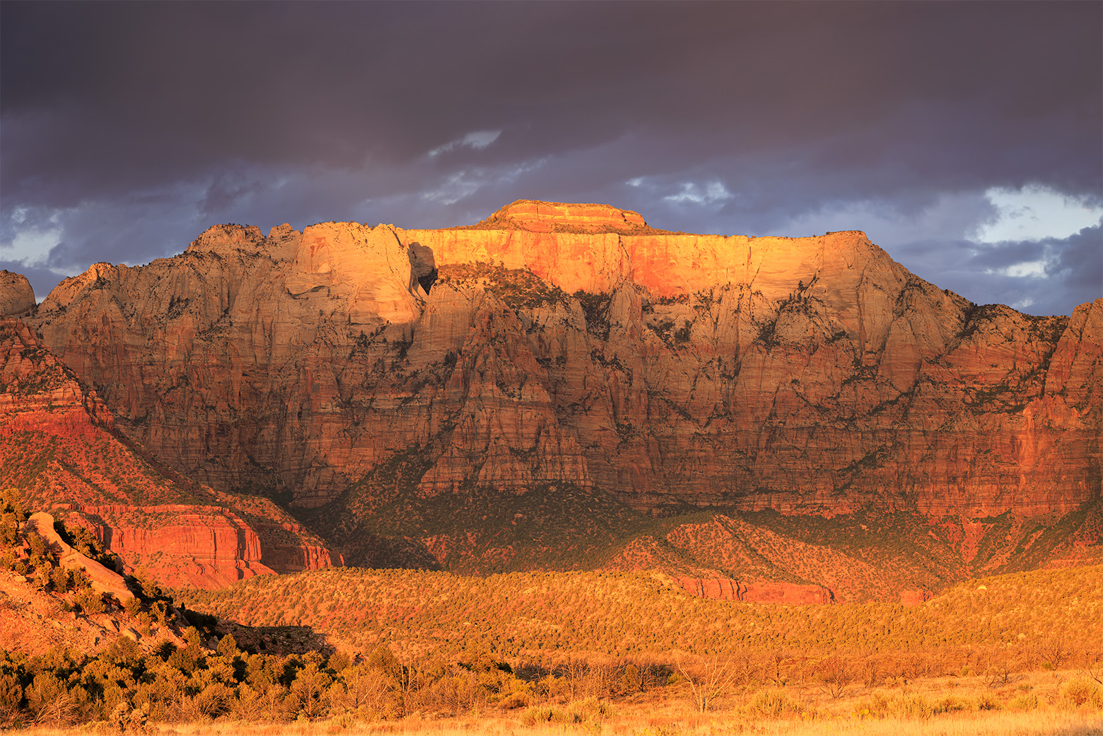
This type of light is referred to as dappled light. It can produce stunning results when the right conditions and the right landscape come together. This evening I had both stunning landscape and stunning dappled light. Great light shafts were illuminating the West Temple (another photographer captured a rainbow this same evening). Of all the images I created this evening I particularly enjoyed this stunning view where the top of the west temple was illuminated. Below it was a dark band followed by another light band of light. I liked the back and forth contrast created with the scene.
My life was upturned and became chaotic in May of this year. My home of 5 years was sold out from under me and my family. With that upheaval came the reality that we were forced to move. In the end the move turned out ok, but it brought many changes. One mundane change that has bubbled up from the sub-surface has been my wife’s desire to switch out our bedspread. As we walked through a department store looking at new blankets for our bed. To try to make things fair my wife asked me to point out a few I like, and she would do the same, and see if we can come to a consensus.
Now, if you are a man and married in a heterosexual relationship, the guy's opinion doesn’t really matter when it comes to bedroom decorations. Thus, my input was of little to no value, but I went along with the ruse anyway. As I pointed out the coverings I liked, and she did hers, my input was rejected wholeheartedly. In this rejection, though, was a subtle self-revealing truth about me. I am drawn to contrast, particularly high contrast.
Life In Contrast
Contrast for you new photographers, is the difference in luminance between light and dark values within an image. There are a few technical definitions out there if you really want to look them up (which I did), but I find the basic idea good enough for what I am discussing today. Functionally, a pure black or a pure white canvas or any other color value has no contrast. A checkerboard board, on the other hand, is pure contrast, being perfectly luminated (white) and perfectly without light (black).
There is a train of thought in landscape photography that more contrast is king. Whether this is true or not is debatable, but there are some biological reasons why, fundamentally, it is true.
Biologically speaking, there are reasons why contrast matters to us as humans. Human perception is tuned to contrast. Harley and Loftus (2004) showed that high contrast graphics were easier to remember than low contrast scenes, and we see them faster too. This is probably associated with nature's warning systems. Well-known organisms such as bee’s, wasps, certain types of caterpillars, and snakes have high contrast. These animals are generally associated with danger. Since the perception of color is not uniform across the domains of life, a more universal method was generally landed upon, contrast. Contrast remains as a mode of communication that cuts through the range of visual systems and environments, both of which change the perception of color, not luminance. Most mammals can’t see red, birds and bees see ultraviolet violet and fish vary so much you can’t say what “fish see” because color is absorbed by water at different depths. A fish that lives in the shallows may see as we do, but something that lives at the bottom of the ocean may only see in black and white. Yet the ability to detect light and dark remains.
You may not have realized it, but your built world is fundamentally designed by your ability to perceive contrast. It only takes one bee sting for a child to remember not to touch yellow and black banded animals. This visual warning system is stuck in the child's head and is then accessed by designers to achieve a goal. Warning signals are black and yellow to draw your attention and say danger ahead while driving. The following logos use this same color scheme to warn you: Radioactive, biohazard, toxic, explosive, laser, and oxidizers. High contrast is built into your world which means it can be used as a tool for even you photographers.
Photography and Contrast
Follow the light is a mantra that you might run across as you read and listen to other photographers. Follow the light implies finding the areas in the landscape where the light is doing something interesting and focusing your attention there, and composing an image out of that which is presented. When you focus your lens on these areas, you are automatically photographing contrast as the increase of contrast within that area is the sole reason why you focused on it. No one gets excited about a flat, evenly illuminated wall, but if you put a doorway into a poorly illuminated room with a spot light on a subject within the room, the intrigue is created automatically.
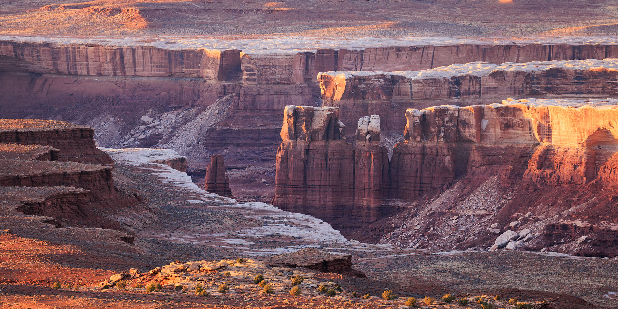
The views in Canyonlands are hard to match... and hard to photograph. Sometimes the landscape seems so big its just so hard to put together. For this image I had to use the telephoto and bring all the landscape down to a small ridgeline highlighting the layers of the canyon as light gently lit the landscape.
Contrast can be used as a tool to pull off a lot of wonderful tricks in landscape photography. Trick 1- Create depth within an image so that the viewer moves throughout your image. Trick 2- creates a separation between things of importance and those that are less important. Trick 3- Create a mood.
Trick 1- Creating Depth
Marc Adamus probably gave one of the best pieces of advice out of the hundreds of podcasts and articles I have ever read when it comes to the value of contrast within a scene and how to use if effectively. One basic rule of thumb to be used in a grand landscape is to have high contrast in the foreground and progressively lower contrast as you move into the background. This principle mimics the natural scattering of light found in nature.
This concept technically is not groundbreaking, as many of you may have noticed it in your images, as it naturally occurs anyway. For some of you, this might be the first time this has been pointed out to you. Taking this principle, if you want to, can force depth within your image using this simple technique.
Trick 2- Separation of Importance.
Some parts of an image are more important than others. Some parts of the image are the subject while the rest of the image is background. Background can be both physically far away or it can be the backdrop to your subject. One method to make this more apparent is the process of making the background have less contrast while making your subject have more contrast.
Remember, back at the beginning of this article, I pointed out that a study revealed that high contrast objects were shown to be recognized faster. Using this principle, if your subject, say an animal, had higher contrast than your background, it would make the subject stand out and be the first thing the viewer's eye gravitates towards. This trick allows you as the artist to control the viewer. Higher contrast also has more visual weight, causing the viewer to stare at the desired region within your photo longer. Once again, allowing you as the artist a way to communicate importance rather than hoping that you get the message to them.
Trick 3- Creating Mood
Every woodland photographer knows that foggy days are good days as they create a mood. Every grand landscape photographer knows that clear days (days that are not hazy) for grand landscapes create sharp, punchy images that are eye-catching. The mood of an image can be created using contrast, whether that was actually happening in the field or through post-processing.
Low contrast scenes are often described as a dreamy, ethereal state. Why, I can’t say. I think it is associated with sleep and coming from a dream world to reality, and the not-so-clear separation between the two. High contrast scenes, on the other hand, define reality and are grounded in what humans see and feel on a day-to-day basis. That is why there is such a strong reaction between the two. When we see low contrast ethereal scenes, we are caught off guard and are drawn to them as otherworldly, even though they are a daily common occurrence in life in some parts of the world. When we see ultra-high contrast scenes, we gravitate towards them as they fall under our biological interest.
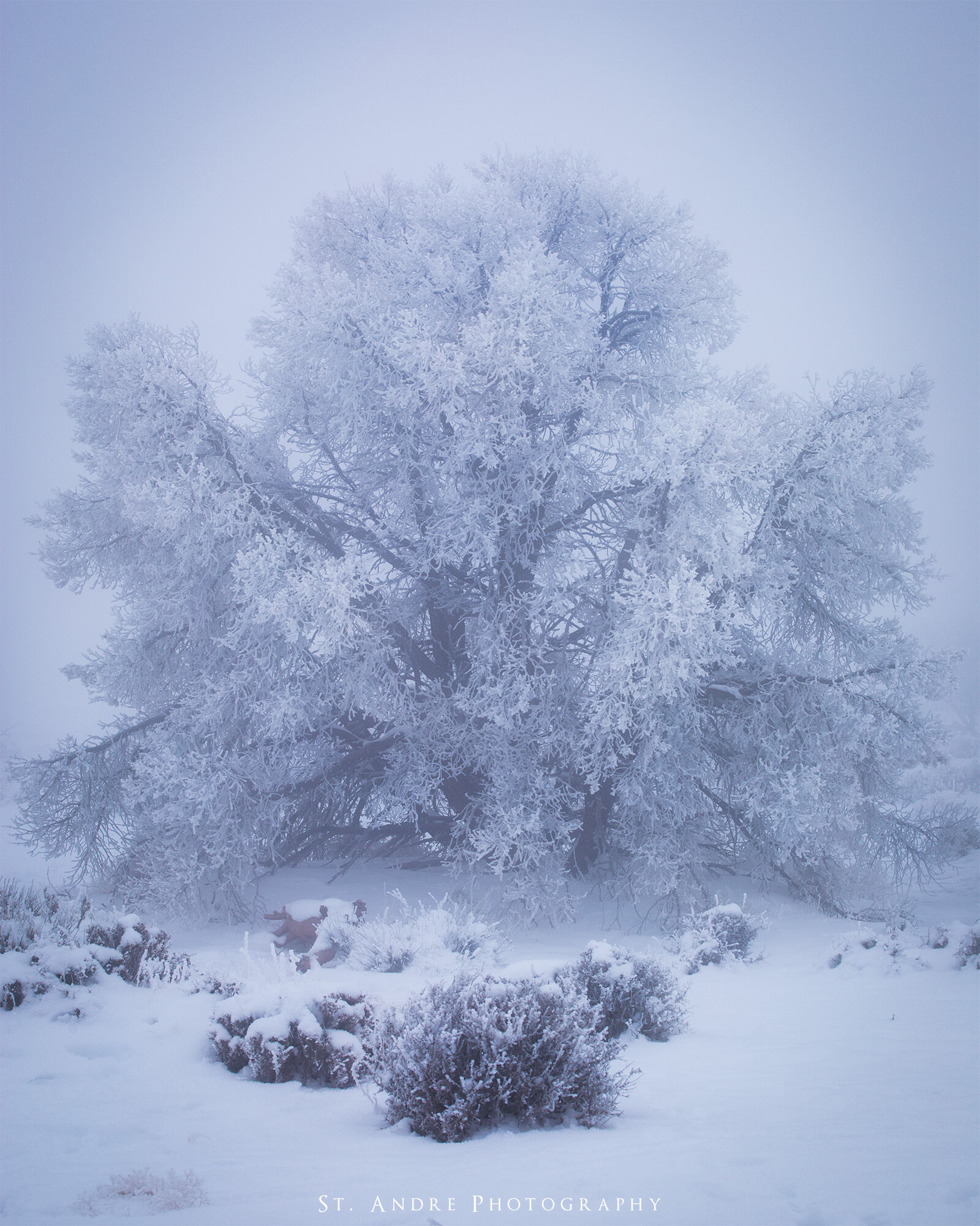
I was in canyonlands a few years back when a layer of fog set across the landscape leaving everything in a frosty mist and the plants covered in hoar frost. It was such an odd experience and a challenging one as ever image was simplified but very similar to the next one.
Techniques of Contrast
If you can open Lightroom on your computer and I want you to go down through the list of sliders presented to you. First, you have Tone sliders which allow you to control contrast by effecting highlights, shadows, blacks, and whites. Following these tone sliders are the Presence sliders that affect texture, clarity, and dehaze. These more subtle sliders are essentially micro-contrast adjusters that affect different pixels to change how the image is perceived. The most popular of these is the dehaze slider, as it increased contrast quite nicely in an image. Next is a tone curve box that once again allows you to adjust brightness values and contrast. I think you get my drift, a lot of Lightroom is simply controlling contrast in a variety of different ways.
Now Nathan what is the best way to work with contrast? You just pointed out that there are eight sliders and a tone curve box that effects contrast within Lightroom. I feel so overwhelmed! Well dear reader let me say the following: There are a thousand ways to skin a cat!
Photographers are a funny breed when it comes to contrast and the best ways to work with it. One oddity is the swearing that the best, most effective way to edit an image's contrast is to avoid using the contrast slider and using the tone curve only. I say “nuts” to that idea, as General Anthony McAuliffe said “nuts” to the Germans when asked to surrender. I find the correct way to add and work with contrast is simply whatever way you like. Did you get the desired result? If the answer is yes, then keep using your contrast slider or whatever method you chose. If you liked the result you got using the tone curve, keep using it. Much of photography is about the final work; very little matters on how you got there as long as you do it honestly. I guarantee you buyers of images don’t care that you used the tone curve or the contrast slider when adding contrast. They just like the image and want it on their wall.
That doesn’t mean that all methods are created equal and some methods of adding or reducing contrast get you to the final result faster. And if you don’t know what you want your final result to look like, then I guess it doesn’t matter which route your take.
The Path of Progress
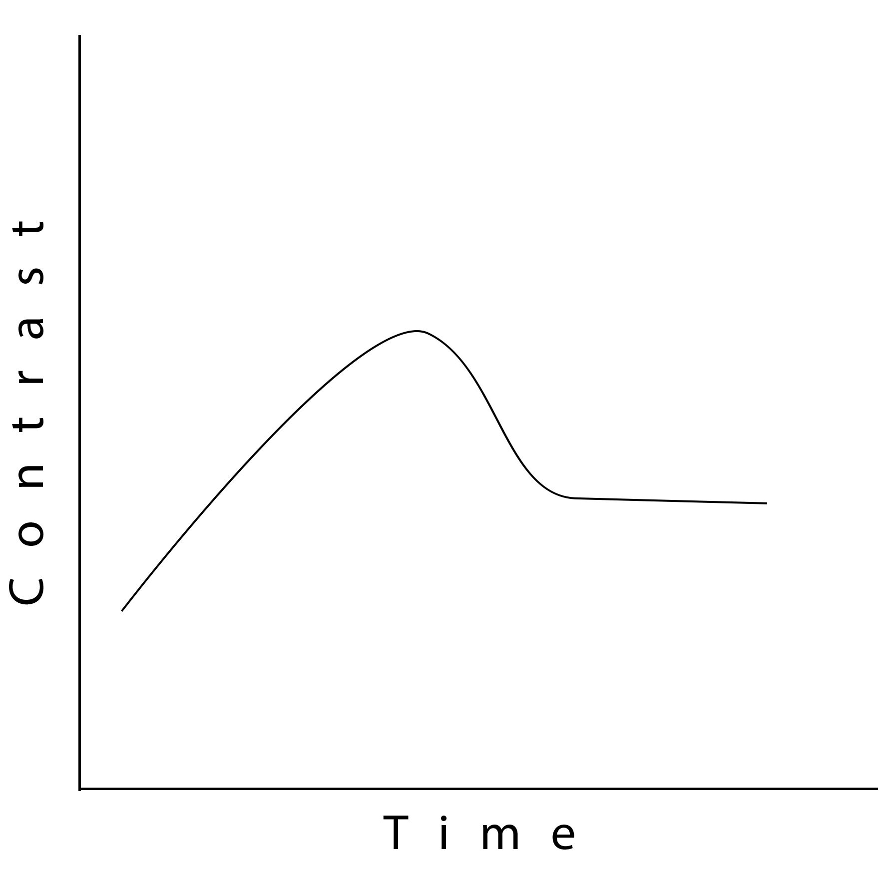
I am going to say right now, that my preference for images is usually higher contrast. So, in general, I do everything in my power to add contrast to my images so I get some desired result. But then comes the obvious question: “When am I adding too much contrast?” In the moment, it is almost impossible to know for sure if you are adding too much contrast. I find most artists have to go on a contrast journey where they go from not enough contrast to too much to something in the middle before they find “enough.” This is why practice matters and why looking at other photographers' work matters. If you do the two things above and then come back to your work and say “did I get this right?” critically, you will begin to find someplace you find desirable, and hopefully others do too.
Current Patterns of Contrast in the Industry
I find there are three techniques in the current zeitgeist landscape photography. Style 1- Light Bleed. Style 2- Low contrast scene with bright highlight point. Style 3- General Global Contrast. As I walk through these different techniques seen in the field, I want to point out none of them are better than the others. Each has held a prominent place at the top as the most predominantly used technique in the genre. Each can be used to accomplish the goal of the artist.
Style 1- Light Bleed.
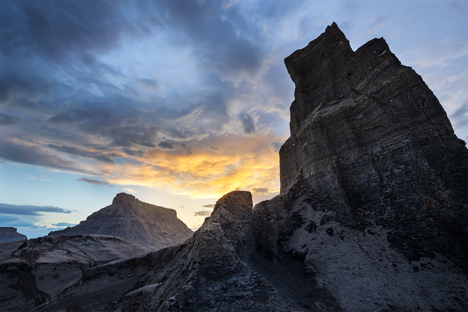
Light bleed was a technique that appeared the early 2010’s as a method to take a normally high contrast scene and add a bloom of “light” to a scene. This bloom of light was almost like adding a warm glowing fog layer over an image to combine the high contrast view of a grand landscape with the ethereal dream scape of a foggy scene. Now I don’t personally use this all that much but it has served a good purpose a few times. In the factory butte image below, I used a light bleed across Factory Butte to add warmth and to reduce contrast to make the image flow more naturally. Look to Ryan Dyar as a good example of a photographer who uses this technique frequently and well.
Style 2- Low Contrast Bright Highlight.
Technically the image above is a good example of this idea, but a frequent pattern seen throughout landscape photography, particularly in the Instagram era, was the super dark landscape with one bright highlight region. Most of the image had low contrast underexposed regions with one really bright highlight caused by the sun or some mythical phenomena. I add the mythical part because it often shows up in astro photography, where the transition from sky to ground is a radiant glow of light. I personally have never seen this in the wild, but it does make for a very pretty image. The bright region creates a sharp contrast zone within the image that draws all the attention to itself. If done well this technique makes for a very compelling way to present images that are both ethereal and frankly kind of cool.
Style 3- General Global Contrast
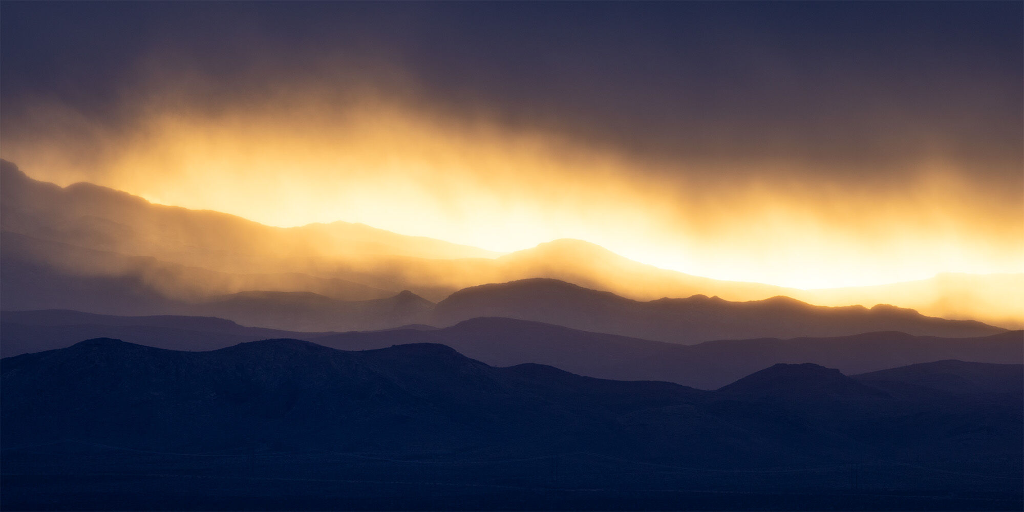
This style is done by the basic use of sliders, global and local adjustments, leading to an overall image of pleasant contrast that is generally uniform in look. I would say basic photography. Nothing particularly fancy on the surface, but can be done with great skill to get the viewer to go to where you want them to go. In general, I think most photographers sit in this genera. Some do it better than others, and they might have a few fancy techniques to add contrast in such a way that the viewer wont even notice how effective they are.
I find most of my work is in this vein of photography. I like it here and occasionally find ways to explore other styles. It often means my images are not cutting edge, but they make for good images that hang on walls. Not too dark and easy to see the subject.
Citations
Harley, E. M., Dillon, A. M., & Loftus, G. R. (2004). Why is it difficult to see in the fog? How stimulus contrast affects visual perception and visual memory. Psychonomic Bulletin & Review, 11, 197-231.
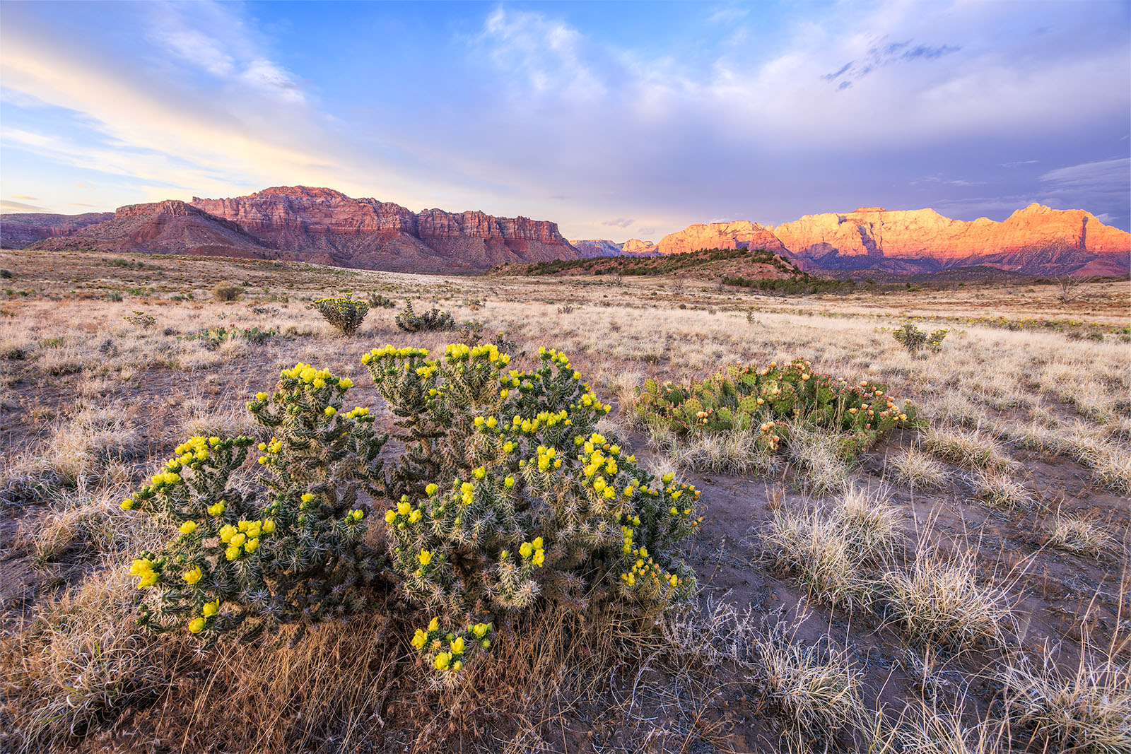
In ten years of photographing Zion, this is the second time I have been able to see cholla in bloom in the park. Frankly the last time, it wasn't even in the park. So this is kind of a cool moment for me to see. In particular, it was really stunning to see all the other cactus in bloom along side the cholla.
This type of light is referred to as dappled light. It can produce stunning results when the right conditions and the right landscape come together. This evening I had both stunning landscape and stunning dappled light. Great light shafts were illuminating the West Temple (another photographer captured a rainbow this same evening). Of all the images I created this evening I particularly enjoyed this stunning view where the top of the west temple was illuminated. Below it was a dark band followed by another light band of light. I liked the back and forth contrast created with the scene.
The views in Canyonlands are hard to match... and hard to photograph. Sometimes the landscape seems so big its just so hard to put together. For this image I had to use the telephoto and bring all the landscape down to a small ridgeline highlighting the layers of the canyon as light gently lit the landscape.